Ever put on a gorgeous gold necklace, only to feel like something's off as soon as you look in the mirror? You’re not alone. Picking the wrong color combo with gold jewellery can ruin your whole look, no matter how stunning the piece is. Some colors just don’t get along with gold, and it’s not about price—it's about clashing tones and weird contrasts.
Messed-up color pairings are more common than you think, and they’re always more obvious when gold’s involved. Why? Gold is a rich, warm metal that stands out. If you mix it with the wrong shade, it can either look too flashy or totally washed out. Knowing what to avoid saves you from awkward fashion moments.
If you want your gold jewellery to look intentional and polished, it’s all about knowing which color combinations just don’t work. Stick around if you want to avoid the most common color mistakes and find out what actually works with your favorite gold pieces.
- When Gold Goes Wrong: The Power of Color Pairing
- Combo #1: Gold and Neon Colors
- Combo #2: Gold with Dark Gray or Charcoal
- Combo #3: Gold Paired with Certain Pastels
- Why Do These Combos Clash? The Science Behind It
- Style Tips: Picking Colors That Make Gold Shine
When Gold Goes Wrong: The Power of Color Pairing
Gold jewellery can go from elegant to awkward fast if you’re not paying attention to color pairing. Gold is a gold jewellery staple because of its warm, shiny look, but not every color gets along with that golden vibe. That’s why knowing what works (and what doesn’t) is as important as the jewellery itself.
Here’s the thing: gold sits on the “warm” side of the color wheel. Colors also have moods—warm, cool, or neutral. Mix the wrong moods and your entire look can end up clashing, making even expensive pieces look out of place. Stylists stick to this rule: the color next to your gold jewellery should complement it, not fight it. Most bad combos come from ignoring this basic color theory.
Think about it. When you see gold against certain colors, sometimes it looks bold, like it’s supposed to be the focus. But if the background or clothing color is too harsh, super dull, or oddly matched, the gold can lose all its charm. Even big brands have flopped by picking weird color combos—this isn’t just a newbie problem.
Want proof? A 2023 survey by an Indian jewellery retailer showed that over 60% of buyers felt disappointed with a gold piece once they wore it with “clashing” outfits. The wrong mix makes people doubt their style choices, and that’s never fun.
Here’s a quick breakdown of why this happens:
- Gold pops best with rich jewel tones and creamy neutrals.
- Super bright or overly cool tones make gold look cheap or out of place.
- Odd, washed-out pastels can dull gold’s shine.
For every well-planned jewellery design, there’s a color combo that can break the look. So if you want your gold jewellery to get all the right attention, start with color pairing—that’s where things usually go wrong or right.
Combo #1: Gold and Neon Colors
If you want your gold jewellery to turn heads for the right reasons, it's smart to keep it far away from neon colors. Neon shades like hot pink, electric yellow, and bright green were huge in the '80s and keep popping back on Instagram, but they don’t mix well with gold. Gold has a warm, classy vibe—neons are loud, sharp, almost glowing. When you try to pull them together, the result is a harsh clash that makes both the gold and the neon look less appealing.
People sometimes think neon will make gold jewellery designs more modern or edgy. In reality, neon usually overpowers the gold, making it look cheap instead of luxe. Want proof? Check out photos from some past runway seasons—when models wore neon outfits with gold accents, even high-end designers got slammed on social media for the jarring effect. Most stylists now avoid these combos because of the negative feedback.
Here’s how neon impacts the look of gold:
- Neons reflect a lot of light, drawing attention away from the detailed work in jewellery.
- The color temperature of neons is cool and sharp, while gold is warm, so their undertones fight each other.
- Wearing neon near your face with gold earrings or necklaces can make your skin look uneven and the gold look orange or greenish, depending on the dominant neon shade.
If you absolutely love neon, try keeping it in your nails or shoes, far from your jewellery zone. Or, pair neon with silver or platinum instead, which holds up better with such bright shades. For gold, stick to classic whites, blacks, or muted colors to let your gold jewellery really shine.
Take a look at how neon and gold perform side-by-side against other options:
| Color Combo | Result on Gold Jewellery |
|---|---|
| Gold + Neon Pink | Clashes, makes gold look dull or overly yellow |
| Gold + Neon Green | Creates a greenish hue, skin looks odd |
| Gold + Plain White | Gold pops, looks premium and balanced |
Bottom line: When you want to flaunt gold, steer clear of neon and your look will instantly feel more timeless.
Combo #2: Gold with Dark Gray or Charcoal
Here’s one most people don’t expect—gold jewellery just doesn’t vibe with dark gray or charcoal. You might think these darker neutrals would let gold stand out, but what really happens is they end up looking flat and lifeless together. The reason? Gold is a warm, vibrant metal. When you stick it next to dark gray (which usually has cool undertones), the contrast falls flat. Gold loses its glow, and the deep gray looks duller too.
This clash gets even more obvious in low lighting or indoor settings. You’d think a designer watch or necklace would pop on a charcoal shirt or suit, but in real life it’s almost invisible at a distance. It’s like both colors are muting each other out instead of turning heads.
Fashion designer Rina Singh once put it simply:
“Gold is best paired with rich or clear backgrounds—dark gray just saps the warmth out of gold, making expensive jewellery look lackluster.”
If you’re into pairing gold with neutrals, you’re far better off with cream, pure white, or even navy. Gold and charcoal will look serious and heavy, but not in a good way. A quick comparison with some popular neutrals:
| Neutral | Gold Visibility | Best For |
|---|---|---|
| Cream/White | Very high | Necklaces, earrings, bangles |
| Navy Blue | High | Pendant sets, watches |
| Charcoal/Dark Gray | Low | Should be avoided |
So next time you’re picking out an outfit for your best gold pieces, skip anything in dark gray. Go for backgrounds that really pop, and your gold jewellery will draw the eyes the way it’s supposed to.
Combo #3: Gold Paired with Certain Pastels
Pairing gold jewellery with pastels seems innocent, but it often leads to a style mess. Not all pastels are a problem, but some just don’t work with the warm, bold vibe of gold. The most stubborn offenders? Pale pink, washed-out lavender, and baby blue. These colors make gold look dull, and sometimes the gold actually highlights how muted the pastel is, making your whole look feel off.
This isn’t just a guess—there are visual reasons behind this. For example, gold reflects light in a warm way, which can make cool pastels appear faded or, in some cases, slightly yellowish. Pastels have low saturation, while gold is naturally rich and vibrant. When they’re side by side, neither actually wins; instead, they both lose impact.
| Pastel Shade | Effect Next to Gold |
|---|---|
| Pale Pink | Looks flat and clashes with gold's warmth |
| Light Lavender | Gets overshadowed, gold turns almost brassy |
| Baby Blue | Makes gold seem less shiny |
Ever seen someone wear a gold choker with a baby blue dress and noticed how the necklace suddenly seems almost plastic? That’s exactly the clash happening in real life. On the other hand, some pastel greens or mint shades can be okay, especially if the green has some warmth. But most cold-tone pastels just lower the energy of your whole outfit.
If you love jewellery design and want to enjoy pastels, try mixing warmer versions like peach, coral, or light tangerine instead. These still offer a soft look but keep gold feeling lively and noticeable. It’s not about swearing off all soft colors. Just skip the icy pastels, and your gold will always look expensive and fresh.
Why Do These Combos Clash? The Science Behind It
Let’s get real about why some color mixes just look wrong with gold jewellery. It all comes down to how our eyes pick up colors, and how certain shades react with the warm, yellow tone of gold. There’s actual science behind this, and it’s got a lot to do with color theory—a trick designers use all the time.
Gold is naturally warm. If you throw in another bold color, like a neon shade, your brain has a lot to process. Neons have a cool base and super high energy, which makes gold look harsh and out of place. Instead of balancing each other, they just fight for attention. That’s why those combinations always feel ‘off’ in photos—even expensive jewellery can’t save it.
Dark gray or charcoal is another troublemaker. While you’d think neutrals with gold are safe, super dark grays absorb light and make gold jewellery lose its pop. You go from eye-catching to dull in one step. The warmth of gold and the flatness of gray don’t sync up, which is why gold looks almost lifeless against that background.
Pastels can also mess with jewellery design, especially ones with blue or green undertones. They’re too soft and subtle, so gold overshadows them—or worse, looks kind of fake. Pastels work well with silver or rose gold, but regular gold? Not so much.
Here’s a quick look at how certain colors affect gold:
| Color Type | Gold Jewellery Effect | Why It Fails |
|---|---|---|
| Neons | Harsh, too loud | Competing strong tones, color overload |
| Dark Gray/Charcoal | Flat, washed-out | Light absorption, dulls gold’s shine |
| Blue/Green Pastels | Fake, off-balance | Gold overwhelms the soft shades |
If you want to get technical, it’s all about contrast and undertones. Warm metals look best with warm or neutral colors. Throw in a color that's too cold or too muted, and your gold jewellery loses what you paid for—shine and style.
Style Tips: Picking Colors That Make Gold Shine
Want your gold jewellery to actually look awesome, not awkward? The colors you wear with it make all the difference. Some shades help gold jewellery designs pop and look way more expensive. Even basic pieces can look special if you pick the right combo.
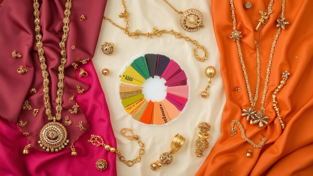
First, gold has a warm, yellowish undertone. It naturally goes well with colors that have a bit of warmth or richness. Earthy tones are super reliable because they balance gold without fighting for attention. Think browns, emerald greens, deep reds, or even navy blue – all these colors make gold the star. Why? Because they create just enough contrast without clashing.
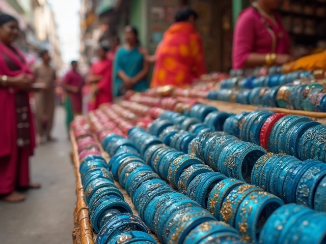
- Emerald green: This color creates a truly classic look. You’ll see this mix in Indian wedding jewellery, where gold and green are everywhere.
- Burgundy & maroon: These shades bring out gold’s warmth and never go out of style.
- Ivory and cream: If you want something soft, not stark, choose these over plain white. Gold looks richer and less harsh.
- Royal blue or navy: Especially for big events, these blues give a cool contrast that actually makes gold jewellery designs pop.
- Deep browns: Chocolate or coffee shades work great for daytime and make gold feel cozy but still sharp.
Looking for more tips? Here’s what stylists and even some fashion designers keep repeating: Go for solid blocks of color in your outfit rather than busy prints when you want your gold pieces to stand out. Busy patterns can easily overwhelm gold’s subtle shine.
Here’s a quick comparison table showing how gold stacks up with different color families for jewellery design:
| Color Family | Gold Jewellery Impact |
|---|---|
| Neutrals (cream, tan, beige) | Chic, subtle, modern |
| Deep jewel tones (green, navy, maroon) | Opulent, striking, bold |
| Bright colors (yellow, orange, pink) | Can feel loud or clash if not balanced |
| Pastels | Usually soft, but some pastels make gold look dull |
One more tip: If you’re mixing metals, like gold with silver or rose gold, keep your clothing color simple. Let the jewellery mix stand out on its own! And always trust a mirror before heading out – some shades look different in daylight compared to your bedroom lights. That last check can save you from stepping out with a combo that just doesn’t work.