👗 Gold Jewelry Color Compatibility Checker
Select a clothing color below to see how it pairs with yellow gold. The tool analyzes undertones and contrast levels to give you a compatibility rating.
Choose an Outfit Color
Visual Preview & Analysis
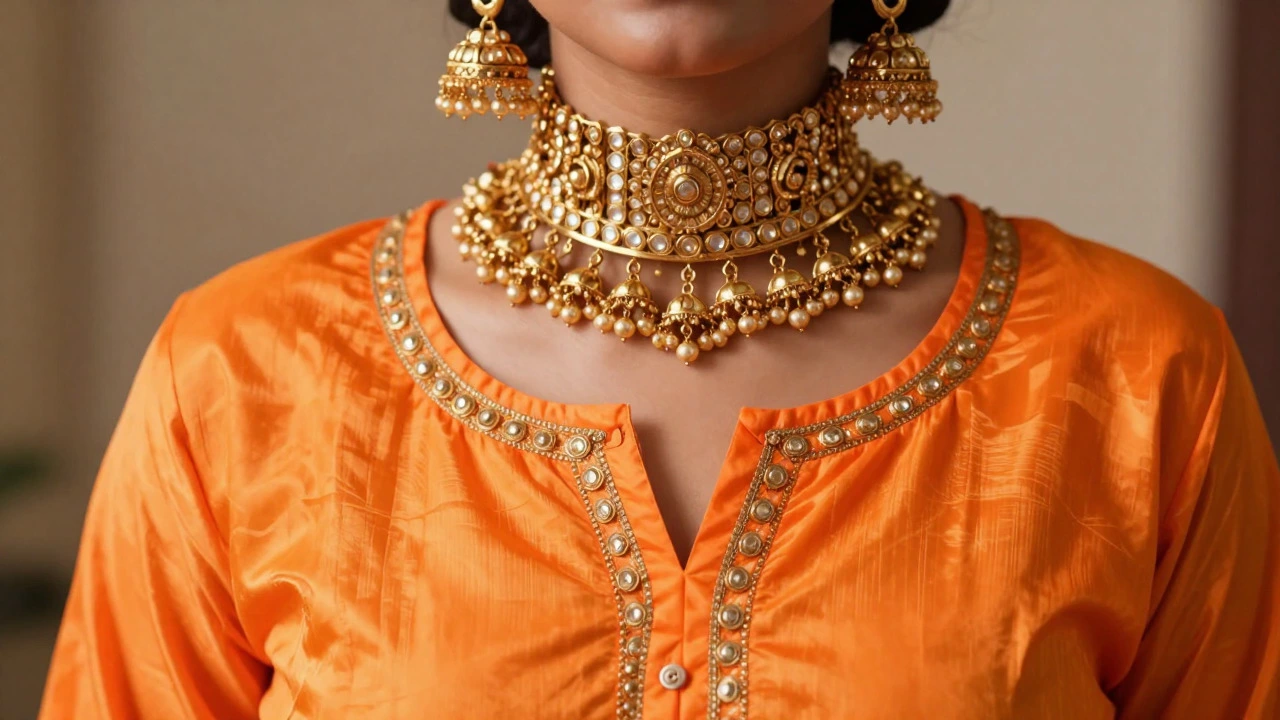
Imagine walking into a room wearing a vibrant neon orange shirt paired with heavy 22k gold traditional Indian jewelry pieces like jhumkas and chokers. The clash isn't just visual; it feels chaotic. Gold is a warm metal that demands respect in your color palette. While it’s versatile, certain hues fight against its natural glow rather than enhancing it. If you’ve ever wondered why some outfits look dated while others shine, the answer often lies in the relationship between your fabric color and your metallic accessories.
This guide breaks down exactly which colors create friction with gold, why they happen, and how to fix them without ditching your favorite pieces. We’ll look at specific scenarios, from office wear to festive events, ensuring your gold jewelry designs remain the focal point, not an afterthought.
Key Takeaways
- Cool-toned pastels like icy blue and mint green can make gold look muddy or dull.
- Neon shades compete for attention, creating a visual noise that distracts from the jewelry's craftsmanship.
- Direct black-and-gold combinations work only if the black is textured (like velvet or silk) or if the gold has significant surface area.
- Warm neutrals (beige, cream, terracotta) are the safest and most flattering partners for yellow gold.
- Always consider the undertone of your skin and the lighting conditions when pairing colors with gold.
The Science of Color Clashes with Gold
To understand what to avoid, we first need to look at color theory. Gold contains copper and silver, giving it a distinct warm undertone. When placed next to colors that have strong cool undertones (blue-based), the eye struggles to reconcile the two temperatures. This creates a "muddy" effect where neither the fabric nor the jewelry looks its best.
For example, wearing a stark white shirt with high-contrast black trousers and delicate gold chains can sometimes feel disjointed if the proportions aren’t right. However, the bigger issue arises with specific hues. Let’s break down the problematic categories.
Colors That Typically Clash with Gold
1. Icy Blues and Mint Greens
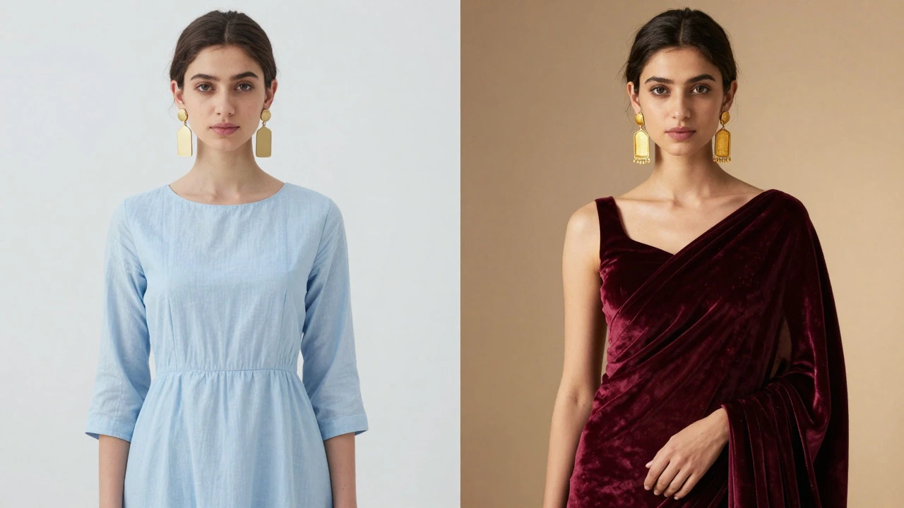
These are classic cool tones. If you wear a pale sky-blue kurta or a mint-green dress, your gold earrings might appear slightly yellowish or tarnished by comparison. The coolness of the fabric absorbs the warmth of the metal. Instead of glowing, the jewelry looks flat. This is particularly noticeable in daylight settings, such as garden parties or outdoor weddings.
2. Neon Shades
Neon pink, electric lime, or bright orange are aggressive colors. They demand immediate attention. When you add gold, which is also a reflective, attention-grabbing material, you end up with two competing stars. The result is often overwhelming. Unless you are going for a very specific avant-garde look, neons dilute the elegance of traditional gold pieces.
3. Direct Black (Without Texture)
Black and gold is a popular combination, but it’s tricky. If you wear a simple, matte black t-shirt with thin gold chains, the contrast can be too harsh, making the gold look like an accessory bolted on rather than integrated. The lack of depth in matte black doesn’t reflect light back to the gold. To make this work, the black needs texture-velvet, satin, or sequins-or the gold needs to be substantial enough to anchor the look.
| Color Category | Specific Shades | Compatibility Level | Reasoning |
|---|---|---|---|
| Cool Pastels | Icy Blue, Mint Green, Lavender | Low | Undertone mismatch causes gold to look dull |
| Neons | Electric Pink, Lime Green | Low | Visual competition; overwhelms the metal |
| Matte Black | Plain Cotton Black | Moderate | Harsh contrast; requires texture or volume to balance |
| Warm Neutrals | Cream, Beige, Terracotta | High | Complementary warmth enhances gold's glow |
| Deep Jewel Tones | Burgundy, Emerald, Navy | High | Rich backgrounds highlight gold details |
Context Matters: Office vs. Festive
Your environment changes the rules. In a corporate setting, subtlety is key. Wearing a grey suit with chunky gold bangles might feel out of place because grey is neutral but cool. It doesn’t provide the warmth needed to support bold gold. Stick to smaller pieces or ensure your clothing has warmer undertones, like camel or taupe.
In contrast, during festive seasons like Diwali or weddings, the stakes are higher. Here, deep jewel tones like burgundy, emerald green, and royal blue work beautifully with gold. These colors are rich enough to handle the weight of traditional Temple Jewelry or heavy polki sets. The darkness of the fabric acts as a canvas, allowing the intricate details of the gold to pop.
Skin Tone and Lighting Considerations
It’s not just about the clothes; it’s about how the light hits your skin and the metal. If you have fair skin with cool undertones, gold can sometimes wash you out if paired with very light, cool-colored fabrics. In this case, opt for deeper colors or add a layer of warm-toned clothing underneath.
Lighting plays a huge role. Indoor artificial light often has a yellow tint, which harmonizes well with gold. Outdoor natural light is cooler and more neutral. If you’re attending an outdoor event, be cautious with cool-colored outfits. A test in natural sunlight before the event can save you from a stylistic miss.
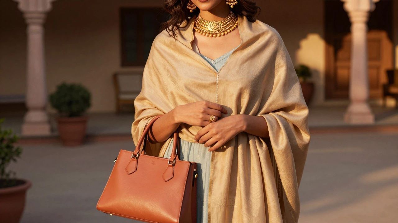
How to Fix a Clashing Outfit
Already dressed in a color that clashes with your gold? Don’t panic. There are simple fixes:
- Add a Warm Layer: Throw on a cardigan or shawl in beige, rust, or mustard. This bridges the gap between the cool outfit and the warm gold.
- Change the Metal Mix: If you must wear the cool-colored outfit, consider switching to silver or platinum jewelry for that day. Save the gold for warmer palettes.
- Adjust Accessories: Use a scarf or handbag in a warm tone to introduce the necessary warmth near the jewelry placement area.
Best Alternatives to Problematic Colors
If you love a particular style but want to keep your gold looking its best, swap the problematic colors for these alternatives:
- Instead of Icy Blue, try Dusty Rose or Peach. These retain the softness but add warmth.
- Instead of Neon Pink, choose Fuchsia or Magenta. These are still vibrant but have better depth.
- Instead of Matte Black, choose Charcoal Grey or Deep Brown. These offer contrast without the harshness.
Frequently Asked Questions
Can I wear gold with white clothes?
Yes, but be mindful of the shade of white. Pure, crisp white can be cool-toned. Opt for off-white, ivory, or cream shades, which have warm undertones that complement gold perfectly. If you must wear pure white, ensure the gold piece is substantial enough to stand out against the brightness.
Does gold look good with denim?
Generally, yes. Denim is a casual fabric that pairs well with everyday gold jewelry. Light-wash denim can be tricky as it’s cool-toned, so stick to simpler, thinner gold chains. Dark-wash denim provides a better backdrop for statement gold pieces like hoops or layered necklaces.
What if I have a lot of gold jewelry? Can I wear it with any color?
Not really. The more gold you wear, the more important the color harmony becomes. Heavy gold sets require rich, dark, or warm backgrounds to prevent the look from becoming overwhelming. Avoid pairing maximalist gold jewelry with busy patterns or cool, bright colors.
Is rose gold different from yellow gold in terms of color matching?
Rose gold has pinker undertones due to its copper content. It pairs exceptionally well with pinks, corals, and warm reds. It can be slightly more forgiving with cool tones than standard yellow gold, but the same principles of avoiding direct clashes with icy blues apply.
How do I know my skin undertone?
Look at the veins on your wrist. If they appear blue or purple, you likely have cool undertones. If they look greenish, you have warm undertones. If it’s hard to tell, you may have neutral undertones. Warm undertones tend to enhance the glow of gold, while cool undertones may require careful color balancing to avoid washing out.