Ever wonder why some gold jewelry just screams elegance while others kind of fade into the background? Well, it might not be the jewelry but the color it's sitting on. Yep, the color you choose as the backdrop can make a huge difference in how your pieces are perceived.
Let's break it down. Gold, with its natural charm, has a warmth that pairs wonderfully with certain shades. But the real question is: which ones? Black and white are the tried and true options, but don't sleep on earthy tones or even something vibrant for a fresh take.
But hey, it's not just about the color. The lighting and where you place that jewelry can totally change the game too. Mix the right colors with smart lighting, and you’ve got a winner. Whether you're showing off a new piece on Instagram or setting up a store display, these tips can give your gold that wow factor.
- Why Color Matters for Gold Jewelry
- Classic Combinations with Black and White
- Earthy Tones for a Natural Look
- Vibrant Colors for a Modern Twist
- Lighting and Color: Getting It Right
- Tips for Displaying at Home and in Stores
Why Color Matters for Gold Jewelry
So, you're probably thinking, "Does it really matter what color I use to display my gold jewelry?" In a word: yes! Gold jewelry isn’t just about the sparkle; it’s about how you set the stage, making the piece pop against its background. The right color backdrop can enhance the warmth and richness of gold, making it stand out even more.
First off, let's talk psychology. Colors impact how we view our surroundings. For example, a beige or ivory color can give off a relaxed, classy vibe, making gold look even more elegant. Black, on the other hand, offers contrast, allowing gold's natural luster to shine brightly. It's like putting a masterpiece in a frame that absolutely does it justice.
Using the wrong background color can make your gorgeous jewelry dull and less attractive. Colors like bright pink or red can clash with gold’s mellow tones and steal its thunder. But a mild blue can create a rich contrast, gently nudging the gold to the forefront in a subtle yet compelling way.
People who sell gold jewelry in stores often use these principles to draw in more customers. They know that carefully selected background colors lead to higher customer engagement and sales.
Even lighting plays a role in how colors affect your display. Soft, warm lights with color-appropriate backgrounds can deepen gold's hue, adding to its allure. If you're setting up a display at home, consider combining these elements to make sure that your treasured pieces always look their best.
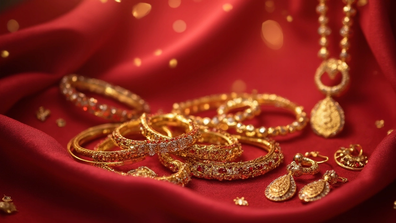
Classic Combinations with Black and White
If you want your gold jewelry to really pop, using black or white as a backdrop is a no-brainer. Let's dig into why these classic combos work so well.
First up, black. It's a powerhouse of contrast. When you place your gold against a black background, the rich warmth of the metal stands out starkly. This is because black doesn’t compete with the shine or color of the gold, but rather frames it perfectly. It's why so many high-end jewelry retailers use black displays. Plus, it's got that sleek, chic vibe. Handy tip: when taking photos for your online store or Instagram, black can really make those gold details pop.
Now, onto white. White backgrounds are like a blank canvas for gold jewelry. The soft brightness of white enhances the luster of the gold without overshadowing it. It gives a fresh, clean look, making the gold appear pure and luxurious. This is why bridal jewelry is often showcased against white—think of those timeless wedding catalog shots. And here's a neat trick: if you're into doing DIY displays at home, pairing a white cloth or board with your gold pieces can instantly elevate the look.
Oh, and if you're wondering how to decide between black and white, it's really about the vibe you want. Black gives a bold, dramatic feel, while white offers a classic, elegant aura. Mixing it up based on the occasion or season could be a fun experiment too.
| Background | Effect on Gold |
|---|---|
| Black | Bold contrast, dramatic look |
| White | Pure, luxurious, elegant |
So, there you have it. Whether you're showcasing a family heirloom or running a full-blown jewelry business, these classic combos of black and white can give your gold jewelry the presence it deserves.
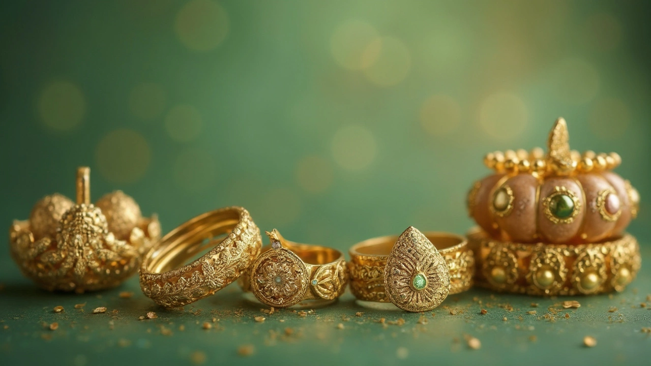
Earthy Tones for a Natural Look
When it comes to making your gold jewelry stand out, earthy tones are a complete game-changer. We're talking about colors like deep browns, warm beiges, and even soft greens. Why? These tones have a unique way of complementing the warm hues of gold, making your precious pieces look even more luxurious.
Earthy tones create a calm and inviting vibe, making them perfect if you're looking to showcase your collection in a cozy, understated way. Imagine setting your gold necklace against a rich, chocolate brown background. The contrast isn't too harsh, allowing the gold to shimmer naturally, catching the light just right.
But wait, there's more. These colors are also great for a more organic feel. Think about it: gold comes from the earth, so pairing it with earthy tones feels like you're bringing it back to its roots. Plus, these backgrounds have a timeless appeal. They’re versatile, working for both classic pieces and trendy new designs.
Consider this: in retail settings, studies have shown that displays using earthy tones can make shoppers feel more relaxed, potentially leading to longer browsing times and increased sales. So, if you’re thinking about how to present your gold jewelry professionally, this might just be the winning color scheme.
When setting up at home, using items like wooden trays or burlap cloth can serve as perfect earthy backdrops for your jewelry. Not only will this make your pieces look stunning, but it can also add a touch of natural elegance to your space.
Vibrant Colors for a Modern Twist
Thinking about shaking things up with your gold jewelry display? Opting for vibrant colors can give your pieces a modern flair. Dive into bold hues like deep reds, royal blues, or even bright turquoise. These colors contrast beautifully with the gold, making the jewelry pop and catch the eye.
Why choose vibrant colors? They create a sense of energy and excitement. Reds, for example, are known to grab attention and can make gold appear richer and more luxurious. Blues, particularly deeper shades, lend a regal touch, while turquoise adds an unexpected modern zing, especially effective when seeking a youthful twist.
Here's an interesting tidbit: marketing studies reveal that color can increase brand recognition by up to 80%. So when you're using bold hues for your gold jewelry displays, you're not just boosting visibility but also creating a memorable aesthetic experience.
- Red: Amplifies the richness and warmth of gold, drawing immediate attention.
- Blue: Creates an elegant backdrop that enhances the sheen without overshadowing.
- Turquoise: Offers a fresh and trendy feel, perfect for modern or bohemian styles.
Keep in mind, though, that vibrant colors demand balance. Too much intensity might overpower the pieces, so it's crucial to have a clean layout that lets the gold jewelry shine. Whether you're curating your Instagram feed or revamping a store window, strategically using vibrant colors can transform how your gold collections are perceived.
Lighting and Color: Getting It Right
So you've picked the perfect color to display your gold jewelry. Awesome! But wait, there's more. Lighting plays a crucial role too. Poor lighting can flatten your jewelry and take away its shine, while good lighting can make it pop. It's not just about having bright lights; it's about having the right kind of light.
Natural light is your best friend when showing off the natural beauty of gold. Morning or late afternoon light is soft and gives a warm glow that flatters your gold pieces. But if you're setting up indoors, that’s where bulbs come in.
Here's a quick rundown on types of lighting to consider:
- LED Lights: These are energy-efficient and come in various color temperatures. Choose a warm white LED bulb between 2700K to 3000K. It complements the yellow tones in gold perfectly.
- Halogen Lights: These provide a bright white light that enhances the sparkle of your jewelry. They're a bit more intense, so they work well in display settings.
- Fluorescent Lights: These are usually cooler in tone and might not be the best for gold since they can dull the warm hues.
Remember, the angle and distance of the light matter too. Lamps or spotlights positioned at a 45-degree angle usually do the trick. This angle reduces shadows and makes sure light is hitting your gold from the top.
Ultimately, combining the right colors and lighting can elevate the display of your treasured gold jewelry. It's like putting on the right makeup to bring out your best features. So, the next time you're about to display your gold, think about these tips and let it shine!
Tips for Displaying at Home and in Stores
Whether you're setting up a small corner at home for your favorite pieces or designing a storefront that stops shoppers in their tracks, displaying gold jewelry has its own set of tricks. At home, it's all about adding a personal touch, while in stores, you want that wow factor to pull people in.
First off, consider the background. If you're going for a classic look, black velvet is amazing for making gold jewelry shine. For something earthy at home, a wooden base adds warmth and an organic feel. Store displays often benefit from white to emphasize cleanliness and elegance. Have you seen those jaw-dropping store windows? They often use contrasting colors strategically to make each piece pop.
Lighting plays a crucial role. Warm, soft lighting can highlight the rich tones of gold without casting harsh shadows. If you're at home, try a table lamp with adjustable angles to spotlight your pieces just right. In stores, LED lights that mimic natural daylight work wonders for showcasing intricate details. Some places even use light reflections to add a bit of sparkle.
- Grouped displays: At home, try grouping items of similar style or occasion to tell a story. In stores, themed displays can guide a customer's journey—from bridal sections to everyday wear.
- Height variations: Don't keep everything flat. Use different heights for your stands to create a dynamic look. This works well at home and brings life to a store display.
- Mirror magic: Adding a mirror beneath your display reflects the shine and adds dimension, making the jewelry look fuller and more vibrant.
- Personal touches at home: Use small decor items like plants or books to make your display feel natural. Inside a store, occasional splashes of greenery or soft fabrics can create a luxurious vibe.
Finally, keep displays clean and uncluttered. Too much bling crowded together just overwhelms the eyes. The goal is to make each piece of gold jewelry stand out while enhancing the overall aesthetic of the space you’re working with.