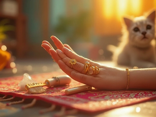
Ever tried on your favorite gold chain and thought, “Why does it just blend in with my outfit today?” It’s not about the gold—it’s the color you’re pairing it with. Colors can make gold scream for attention or go completely unnoticed.
Picture this: you’re wearing a black dress and suddenly, your gold necklace looks bolder and richer. That’s no accident. Black isn’t the only shade that does the trick, but it’s the classic go-to. Want your gold to catch every eye in the room? Picking the right color as your canvas makes a huge difference.
It’s not just about dark vs. light, either. There’s a simple science behind why certain backgrounds set gold apart, making it shine brighter, warmer, and more expensive-looking. Stick around and you’ll learn why your wardrobe is actually one big secret weapon for your gold jewellery collection. You’ll be surprised at the unexpected color combos that work—even some most people would never dare to try.
- The Science Behind Gold and Color
- Classic Colors That Highlight Gold
- Surprising Combos: Colors You Never Considered
- Occasion-Based Color Choices
- Real-Life Style Hacks for Everyday Glow
The Science Behind Gold and Color
There’s a legit reason your gold jewellery stands out—or disappears—against some colors. Everything comes down to contrast and how our eyes react to shiny things against different backgrounds. Gold, as a metal, reflects light in a super specific way. It’s all thanks to the way gold sits on the color spectrum: it absorbs blue and violet and bounces back that warm, golden yellow. When you put gold next to colors that don’t have much yellow, it instantly pops.
Designers and photographers love this trick. That’s why you see gold jewellery in ads with dark or cool backgrounds, because these act like a spotlight. Pair gold with navy, emerald green, or deep purple and—boom!—the jewelry looks pricier and richer. But toss gold on something yellow or orange and it sort of blends in, because there’s not enough contrast. If you’re choosing an outfit or background for selfies with your gold pieces, think about contrast first.
Some folks may not know that human brains are wired to be attracted to warm, shiny things. It’s an old survival instinct. So when your gold ring sits on a color far away from gold on the color wheel—let’s say, cool blues, dark greens, or just classic black—your brain shouts “look here!”
- Gold jewellery glows best against cool or dark shades.
- Light, pastel, or metallic gold backgrounds make gold jewelry look flat or washed out.
- Even the lightning matters: natural light bounces off gold better than harsh white bulbs.
Here’s a quick comparison to make it even simpler:
| Background Color | Gold Jewellery Impact |
|---|---|
| Black | Most dramatic, high contrast |
| Deep blue | Rich, bold accent |
| White | Soft, less contrast |
| Yellow/Gold | Blends in, minimal pop |
| Green or Purple | Unexpected brilliance |
It all comes down to the science of light, color, and how our brains love anything shiny. That’s why the right color choice can make your gold jewellery designs go from okay to wow.
Classic Colors That Highlight Gold
Everyday experience (and a quick scroll on Instagram) will tell you that gold jewellery almost jumps off your body when set against certain colors. These are the time-tested, reliable shades that show off gold’s warm tone and shine. If you’re aiming to make your gold jewellery the main attraction, stick with these easy winners.
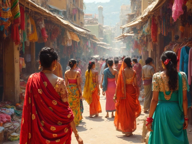
Black is the champion. Gold and black together have been a power couple forever. The contrast is extreme—gold shines, and black just disappears into the background. Outfits in black, like sarees, dresses, and even T-shirts, always make gold necklaces, bangles, or earrings look richer. That’s because black absorbs light and helps the metallic glow stand out.
White is another solid choice. The crisp, clean look of white amplifies the classiness of gold. A basic white shirt or kurta makes gold rings and chains look more modern and sharp. The reflective light from white also boosts the shine of the gold, instead of competing with it.
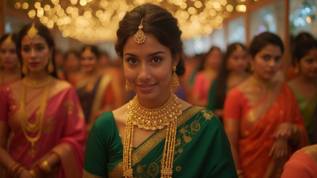
Don’t forget deep jewel tones. Navy blue, emerald green, and even burgundy provide a background that’s dark enough to highlight gold, but colorful enough to avoid the seriousness of black. Especially for Indian outfits or weddings, gold jewellery paired with these rich colors just feels luxurious. These shades sit far from gold in the color wheel, which is why the contrast is instantly eye-catching.
- Royal blue or navy: Perfect for bold gold statement pieces.
- Dark green (emerald): Pairs beautifully with intricate gold designs and gemstones.
- Burgundy or maroon: Great for traditional gold sets during festivals or family functions.
Here’s a quick comparison showing how different colors boost or dull gold jewellery:
| Background Color | Gold Jewellery Visibility | Occasion |
|---|---|---|
| Black | Outstanding | Formal, Festive |
| White | Very Good | Daytime, Casual |
| Navy Blue | Excellent | Traditional, Party |
| Emerald Green | Excellent | Traditional, Formal |
| Burgundy | Very Good | Festive, Cultural |
Avoid pale yellows, beige, or very light pastels—these have undertones that are close to gold, so your jewellery blends right in and loses impact. If you want your gold highlight to really pop, just remember: the bigger the gap between your outfit color and the gold, the more your gold stands out.

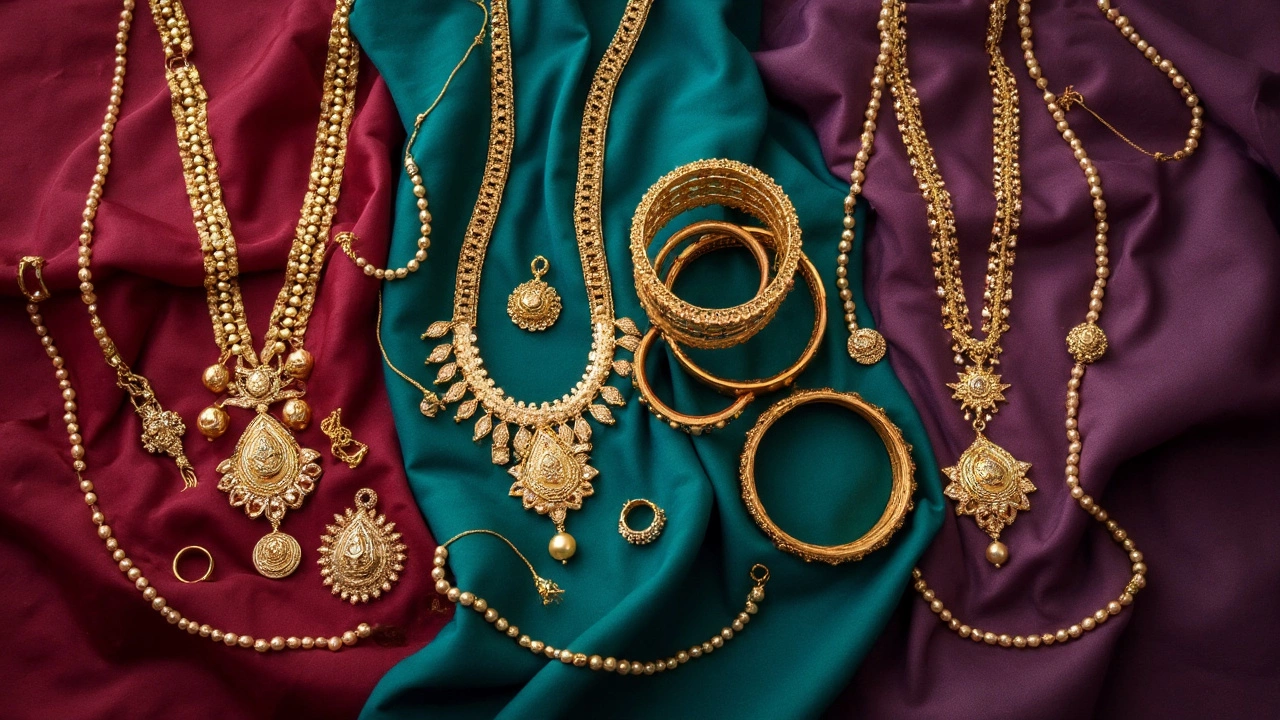
Surprising Combos: Colors You Never Considered
If you want your gold jewellery to really stand out, you don't have to stick with basic black or plain white. There's a lot more you can try that most people skip.
Have you ever thought of pairing gold with teal? This color has a bit of blue and green mixed in, which makes gold look even warmer and more eye-catching. Teal doesn’t overpower your jewellery. It actually works like a fancy stage light, making your gold chains and rings glow.
Try navy blue next time, especially with heavier gold jewellery designs. Navy isn’t as harsh as black but still gives amazing contrast. It’s the sort of color that shows up in runway shows because it gives gold a modern, elegant vibe.
Don’t ignore burgundy or deep reds. These strong, saturated shades make gold look richer. If I’m dressing up for a winter wedding with Ankita, she almost always reaches for maroon or wine-toned outfits with her chunky gold bangles. The combo just clicks and pops in photos every single time.
Now, here’s a real outsider: olive green. It sounds odd, but olive is muted and earthy, which makes gold truly pop without stealing the spotlight. This one works especially well for casual get-togethers where you want your gold to stand out in a subtle way.
Some folks experiment with blush pink or even mustard yellow. Blush is soft, so your gold becomes the star, while mustard yellow gives a retro, boho look that’s hard to pull off—but when it works, it really works. It’s actually trending among top fashion influencers in 2024.
| Color | Effect on Gold Jewellery |
|---|---|
| Teal | Enhances warmth, modern look |
| Navy Blue | Elegant contrast, softer than black |
| Burgundy | Deepens gold glow, looks expensive |
| Olive Green | Earthy backdrop, subtle pop |
| Blush Pink | Soft, highlights gold delicacy |
| Mustard Yellow | Trendy, unique, boho vibe |
If you’re styling your gold jewellery, challenge yourself to pull out one of these colors from your closet. Mix and match, take a few selfies, and you’ll notice the difference right away. These combos aren’t just rare—they actually work. So, don’t get stuck in the black-and-white zone. Gold loves a good surprise.
Occasion-Based Color Choices
Not every event calls for the same look, right? The colors around your gold jewellery can change depending on where you’re headed—weddings, work, parties, or just a lunch out. Here’s how to pick background colors for different occasions so your gold always steals the spotlight.
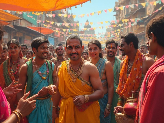
- Weddings & Festive Events: Go for deep jewel tones or classic black. Colors like maroon, emerald green, and navy blue are super popular choices at Indian weddings and make gold look extra rich. Even royal purple is a surprising winner—the contrast just works. Lighter pastels like soft peach or baby pink don’t do justice to gold if you want drama, but they’re fine when you’re after subtlety.
- Work & Day Events: Here’s where things usually get neutral. Whites, creams, taupe, and even olive green keep things professional but still let gold jewellery stand out. A white shirt and gold accessory is a power combo that never fails in the office.
- Casual Outings: Don’t overthink it but try not to pick colors too close to your skin tone, or the gold gets lost. Denim blues, bold reds, or forest green make your gold pieces pop without looking overdressed.
- Evening Parties: Black or deep charcoal remains unbeaten for making gold jewellery look expensive and dramatic. Sequins or metallic fabrics can work too, but make sure they don’t overshadow your gold; sometimes less really is more.
Here’s a comparison of which colors work best for different events with gold:
| Occasion | Best Color Choices | Why It Works |
|---|---|---|
| Wedding/Festive | Maroon, Emerald Green, Navy Blue, Purple | Creates a bold, traditional contrast with heavy gold pieces |
| Work/Office | White, Cream, Taupe, Olive | Stays professional while still highlighting gold jewellery |
| Casual Outing | Denim Blue, Red, Forest Green | Fun, eye-catching, lets everyday gold designs stand out |
| Evening Party | Black, Charcoal Grey, Metallic Fabrics | Adds drama, makes gold appear shinier |
Tip from my wife Ankita: Whenever she wears a gold choker to family gatherings, she purposely picks outfits in dark green or navy. Every time, people notice her jewellery first—not just the dress.
Long story short, matching your outfit’s color to the occasion—and your gold jewellery—means you’ll never miss a chance for your gold to shine. Test a few of these combos in front of a mirror before stepping out. You’ll see right away which shade makes your gold pop for the specific event.
Real-Life Style Hacks for Everyday Glow
Getting your gold jewellery to really stand out doesn’t mean dressing up for a red carpet. You can get that wow effect every day by making a few tweaks to what you wear and how you style your pieces.
- Mix Solid Colors with Neutrals: A plain white or black tee sets off gold in seconds. Even grey, navy, or olive give a soft contrast that highlights gold jewellery without overdoing it.
- Layering Tricks: Stack up gold necklaces with different lengths over darker tops for a richer look. Same goes for bracelets and rings—group a few together, especially if your outfit is one solid shade.
- Work Tops with Texture: Ribbed, chunky knits, or linen make gold pop by giving your jewellery a sharp outline. Avoid busy patterns—they compete with your jewellery and steal the shine.
- Match with Complementary Colors: Jewel tones like emerald green, deep red, and royal blue are proven to make gold look more vibrant. These rich hues bounce up the contrast and make gold jewellery catch the light way better.
- Don’t Forget Accessories: Scarves, headbands, and even phone cases in the right solid color can frame your gold rings or pendants. Ankita once used a simple navy scarf and her old gold hoops suddenly looked way more luxe.
Even beauty basics can help. A little bronzer, a warm blush—anything that gives your skin a sun-kissed glow—can make gold shine brighter against your skin. For those taking photos, pro stylists always recommend daylight or warm lighting to keep the yellow of gold jewellery looking natural and not too harsh.
If you’re ever shopping or planning an outfit, take a look at the table below for foolproof color choices that make gold pop:
| Clothing Color | Gold Jewellery Impact |
|---|---|
| Black | Bold, classic contrast |
| White | Clean, pure shine |
| Emerald Green | Rich, vibrant pop |
| Burgundy | Warm, sophisticated |
| Navy Blue | Chic, sharp statement |
Keep in mind, gold highlight is all about balance. Let your jewellery be the star—avoid too many accessories or heavy prints that draw attention away. With these real-life style moves, you’ll have your gold jewellery looking photo-ready no matter if you’re just running errands or catching up with friends.