Best Color for Selling Jewelry – Boost Your Sales with Smart Color Choices
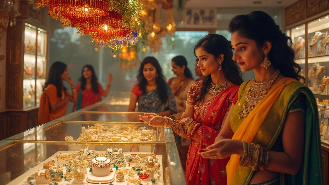
Ever wonder why some jewelers seem to sell faster than others? A big part of it is the color they use around their pieces. The right shade can catch eyes, create a mood, and even persuade a shopper to buy. Below we break down the top colors that work best for selling jewelry and how you can apply them without any fancy design skills.
Why Color Matters in Jewelry Retail
Color isn’t just decoration; it’s a psychological cue. Warm tones like gold, orange, and red signal excitement and urgency, nudging people to act quickly. Cool shades such as blue and green calm the mind, making customers linger longer and consider higher‑priced items. Neutral backdrops—white, gray, or soft beige—let the jewelry itself shine, especially when you’re showcasing colorful gemstones.
Top Colors to Use in Your Store or Online Shop
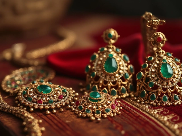
1. Gold background or accents – Gold instantly ties the viewer’s mind to luxury and value. A subtle gold trim on a display case or a gold‑toned banner on a website can make gold, rose gold, or even silver pieces feel more premium.
2. Deep red or maroon – Red grabs attention and creates a sense of urgency. Use a red ribbon, a crimson cushion, or a bold red call‑to‑action button to highlight special offers or new arrivals.
3. Soft white or ivory – White offers a clean canvas that makes any jewelry pop. It’s especially effective for multi‑colored collections because the background doesn’t compete for attention.
4. Navy or charcoal gray – Dark, sophisticated hues give a high‑end vibe. Pair a navy backdrop with a spotlight on a diamond necklace and watch the sparkle stand out dramatically.
5. Pastel teal or mint – These shades are fresh and modern, perfect for targeting younger buyers who love a contemporary feel. Use them sparingly as accent walls or in social media graphics.
When you mix colors, keep the rule of three in mind: choose a dominant hue, a secondary accent, and a neutral base. This prevents the display from feeling chaotic and keeps the focus on the pieces.
Try testing one color change at a time. Swap the cushion fabric from white to navy for a week and track sales of the highlighted items. Small tweaks often lead to noticeable differences without needing a full redesign.
Remember, the goal isn’t to overwhelm the buyer with color but to guide their eyes toward the jewelry. Use lighting that complements your chosen palette—warm LED for reds and golds, cooler white for blues and greens. The right lighting makes the color strategy work even better.
By understanding a few basic color psychology rules, you can turn a simple display into a sales magnet. Start with one of the suggested shades, watch the numbers, and adjust as needed. Your jewelry will thank you, and so will your bottom line.
Unlocking the Best Colors to Maximize Jewelry Sales: Tips Backed by Science
Discover which colors help jewelry sell faster, why color psychology matters, and real tips to make your pieces irresistible—backed by science and real shop experience.